

The COffee Bean & Tea Leaf
The Coffee Bean & Tea Leaf was looking to update their branding and reclaim their coffeehouse authority in Southern California. As the lead creative on the account, I was responsible for concepting and designing their new campaign, as well as creating digital content, redesigning their logos and packaging, art directing a fresh look and voice for their product photography and in-store communications, as well as contributing to their in-store design.
Coffee Bean Rewards
To launch The Coffee Bean & Tea Leaf's app update, we created a stop motion animation following an adventurous stick figure on a coffee run.
My partner and I wrote the script and I worked closely with the director to design the character and the key elements of his animated journey.
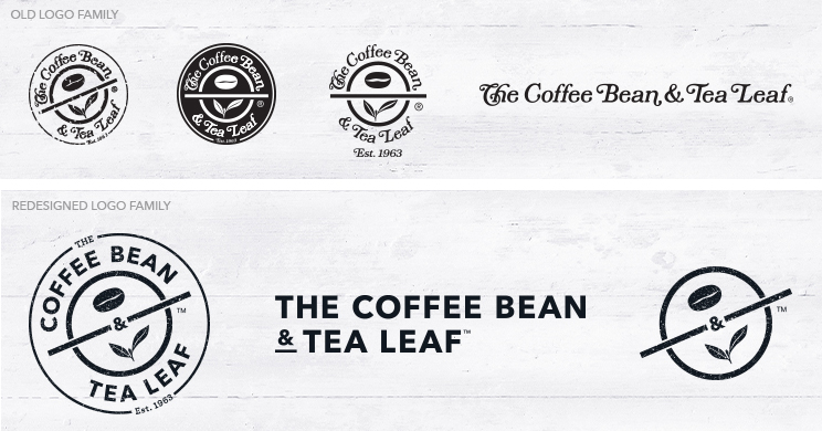
Logo Redesign
The brand had been using four unique iterations of their logo. I created one cohesive logo family based on the redesign of their previous stamp logo.
I modernized the branding by cleaning up the texture and using a bolder sans serif font, both of which helped with legibility. The "the" was minimized to align with how guests were already referring to the brand and help balance the top and bottom of the circle. Lastly, the ampersand was moved to the center of the stamp to visually and symbolically join coffee and tea - the two equally important pillars of the brand.
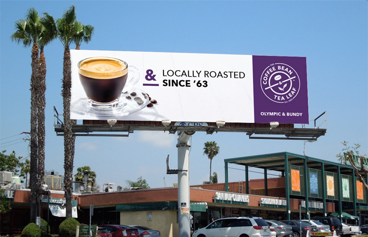
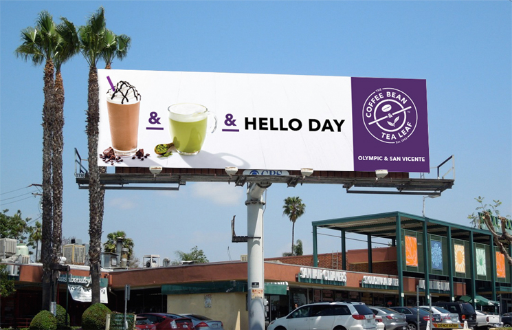
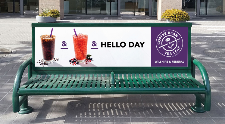
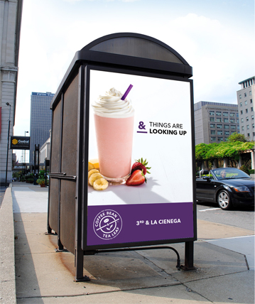
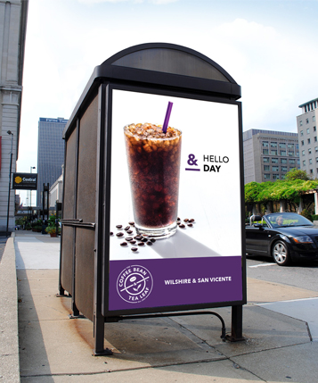
Brand Campaign
Because it had been a number of years since the brand had advertised outside of their stores, we needed a bold, hard-hitting campaign to remind consumers of The Coffee Bean & Tea Leaf's quality products and drive them in to stores.
The ampersand has always been a subtle part of the brand name, but we used it as the key unifying tool to connect the drinks and headlines. And the headlines communicated the uplifting feeling that comes with every cup of coffee or tea sold at our cafes.
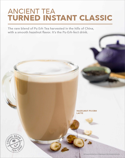
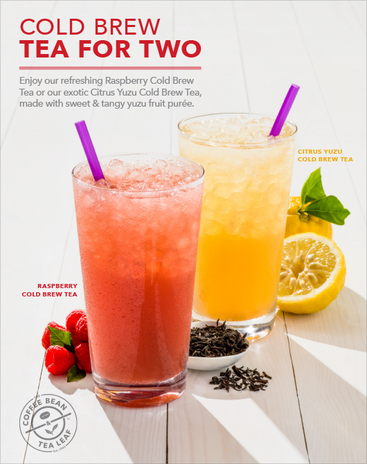
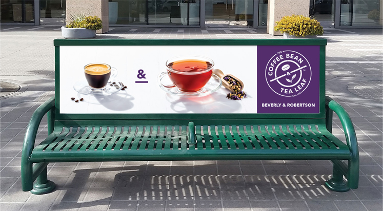
Point of Sale
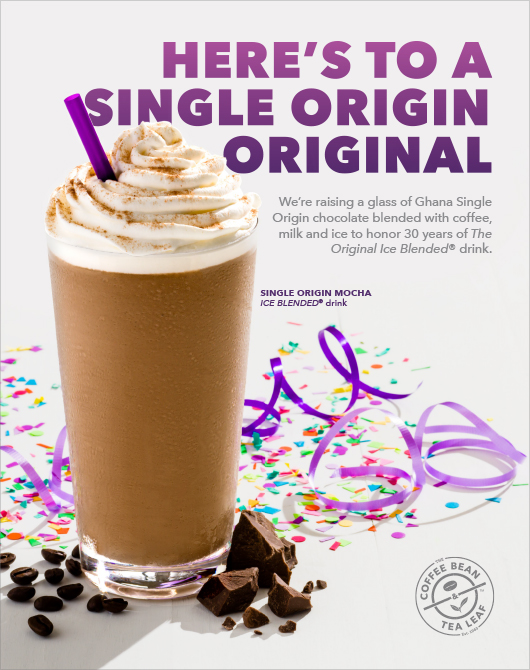
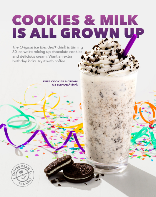
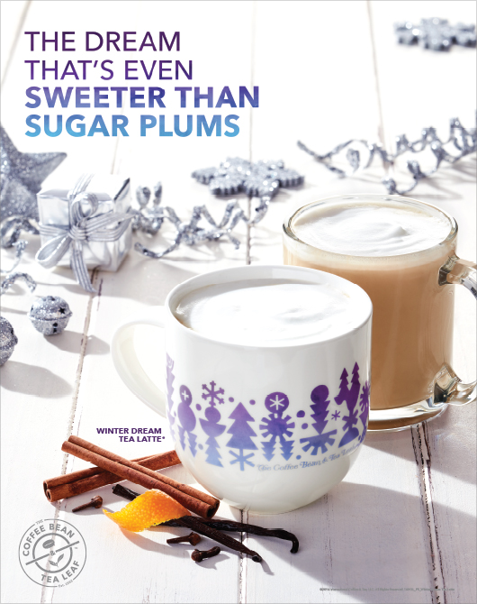
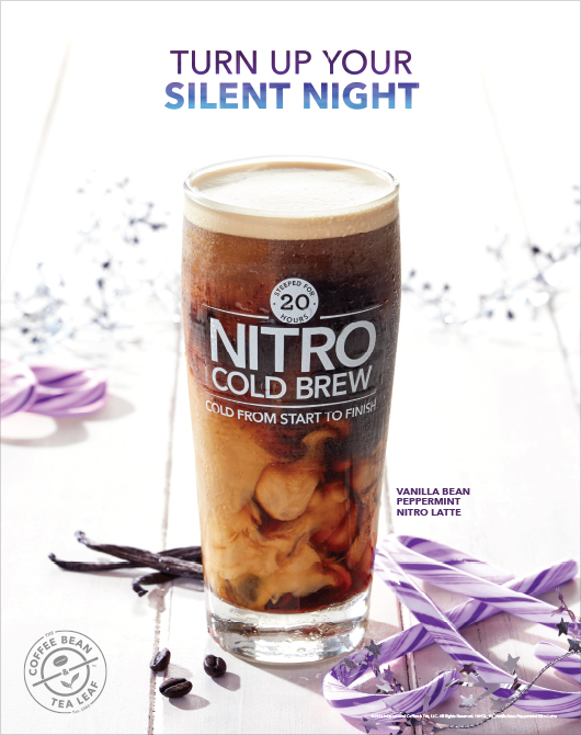
To create a unique and ownable look for product photography, I took inspiration from Los Angeles - the brand's hometown. Bright, natural light and bold shadows capture the vibe of Southern California and differentiate the brand from the traditional dark, moody photography typically used in the coffee category.
This new photography was used in a year of seasonal product campaigns which I designed, built, and often wrote copy for.
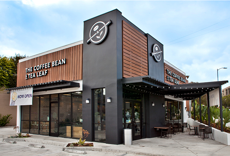
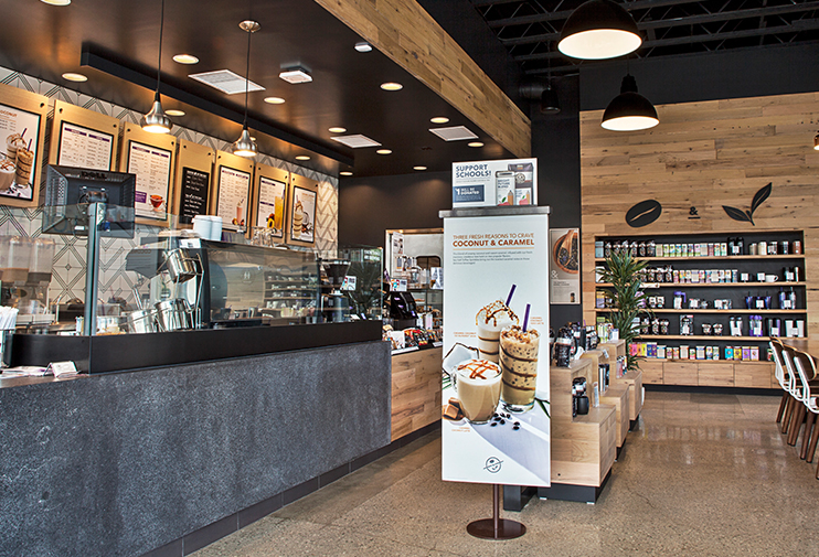
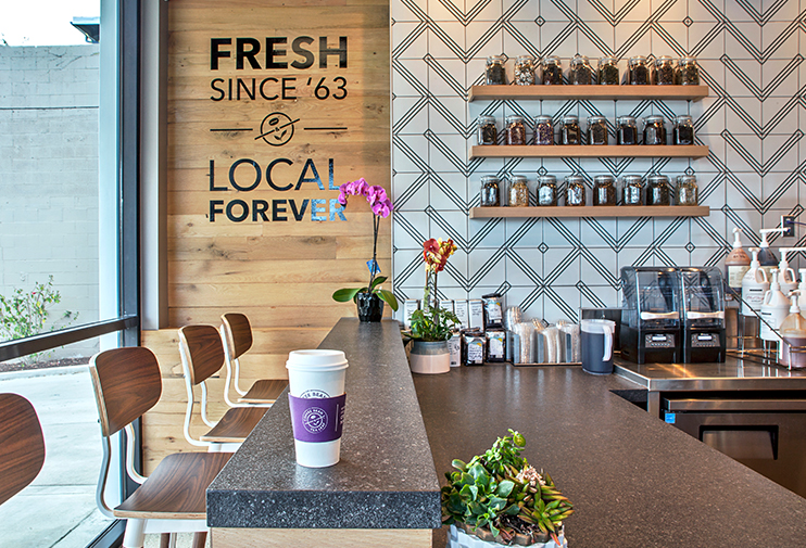
Store Design
I worked closely with The Coffee Bean & Tea Leaf's marketing, operations and store design teams to incorporate the new branding in their stores.
This included writing and designing permanent in-store art and messaging; rethinking product shelving messaging and organization; and informing the artwork and in-store music.